

Four Independent Signals. One Story.
What Different Frameworks Are Telling Me About Bitcoin Right Now


One indicator can be wrong. That’s not cynicism — it’s just how noisy financial markets are. An on-chain metric can give a false signal. A liquidity model can miss a geopolitical shock. An options market can misprice a tail event. Anyone who claims their one framework tells the whole story hasn’t been watching long enough.
But when four completely independent frameworks — built on different data, developed by different teams, looking at different layers of the market — arrive at the same conclusion, that’s harder to dismiss.
That’s what I’m looking at this week. Four maps. And right now, they’re all pointing at the same intersection.
Map 1: The Tide
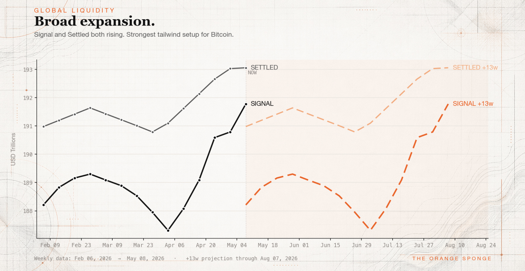
The Global Liquidity chart — the one I run weekly using data from Michael Howell’s framework — opens with a headline that sounds straightforwardly good: Broad expansion. Signal is at $191.78T, up nearly $1T this week. Settled is at $193.06T, up $30B. Both lines rising. The tide is coming in.
But this chart has a feature many liquidity charts don’t: a +13-week projection. Because liquidity generally leads Bitcoin by roughly that window, the dashed lines to the right aren’t a guess about the future — they’re a translation of what’s happening right now into what it implies for three months from now.
If this framework is new to you can check out the orientation piece here: “Reading the Tide: A Guide to the Weekly Global Liquidity Chart”
What those dashed lines are currently showing: a rough patch from roughly late May through late June, followed by a meaningful reversal into late July and August. That rough patch isn’t a new development — it’s the echo of the liquidity contraction that ran from late February through late March. We’ve moved past it in real time. But the lag means it still has to work through the system before it clears.
The summary: the tide might be coming in. But it’s doing it in waves, not a smooth rise.
Map 2: The Price Structure
Several weeks ago, CheckOnChain framework around “Bear Value Zones” — a composite of on-chain metrics including the true market mean, short-term holder cost basis, volume profile, and other on-chain data. These aren’t arbitrary lines drawn on a chart. They’re built from when coins actually moved on-chain, which makes them meaningful in a way that technical levels drawn from price alone often aren’t.
A key level right now sits right around $82k.
Bitcoin has been fighting with that level.
Weekly: it broke above for the first time in months, then got pulled back below. The weekly candle closed as a rejection.
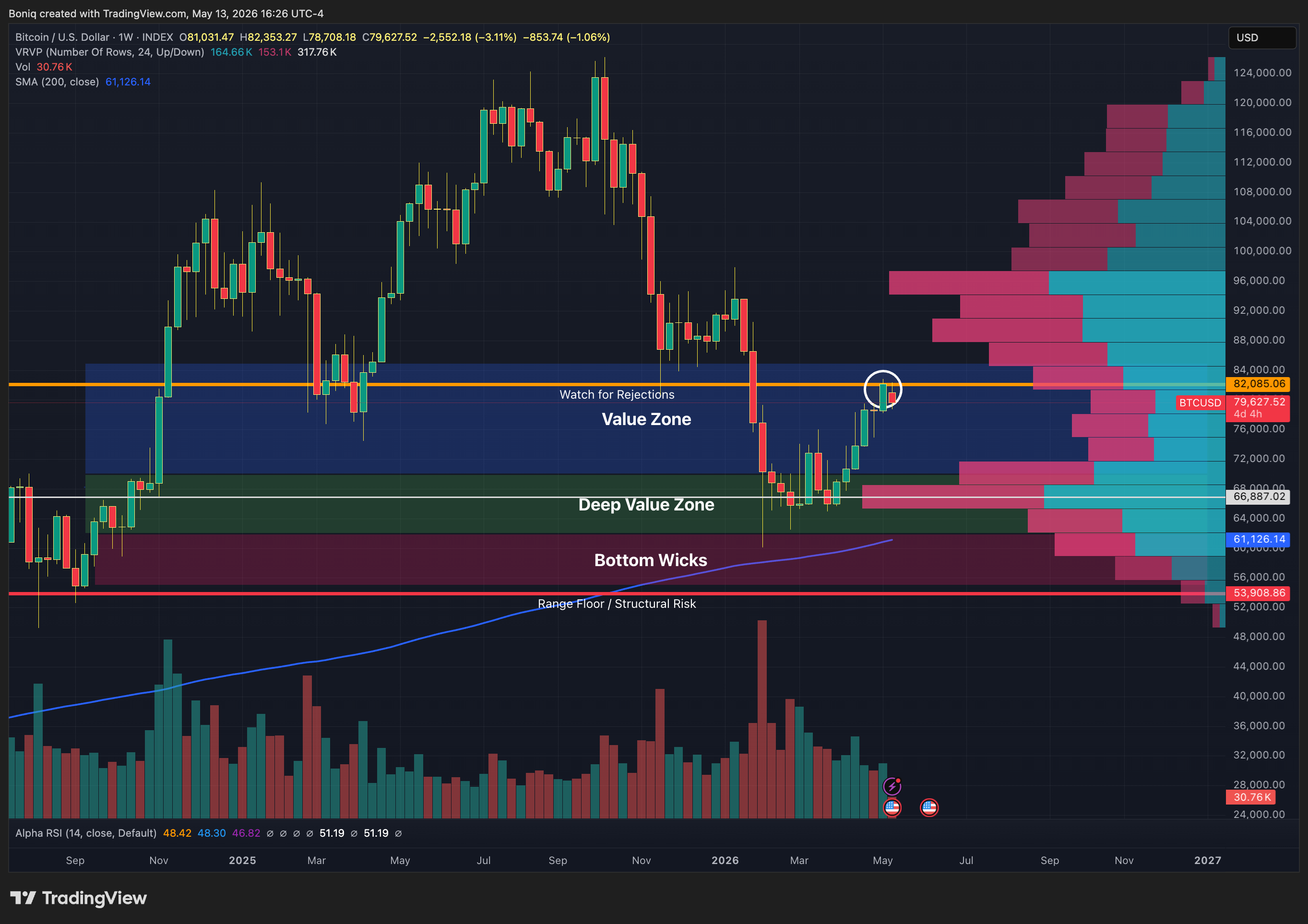
Daily: more granular, the same story played out over several days starting May 6 — briefly touching $82,000 on May 10, then retreating. Also worth noticing on the daily is the blue line - the 200 day Simple Moving Average, a metric tracked by investors of countless asset classes for decades. It could end being the decisive marker of transitioning out of the bear, which means holding above it would have substantial meaning.
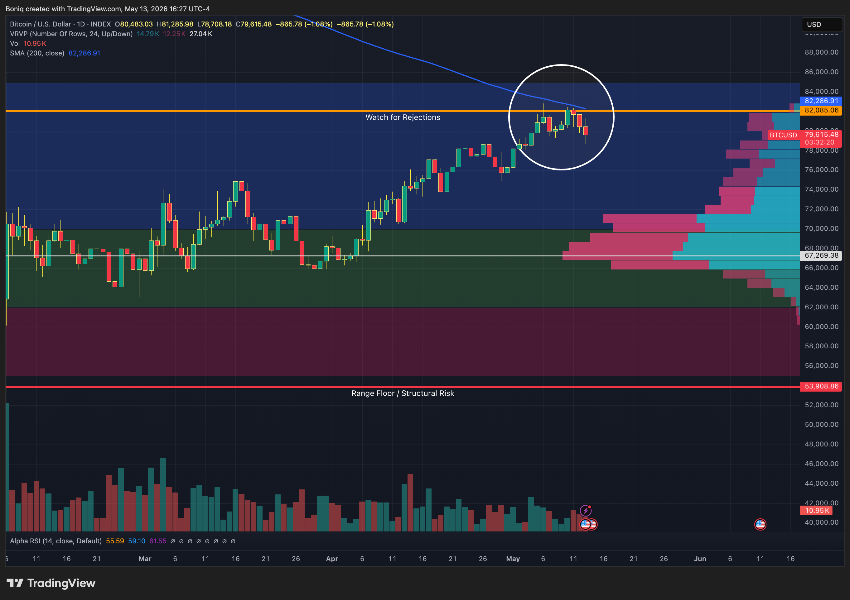
So far it hasn’t even broken through it, let alone hold above the 200 SMA for multiple days or a week. As of now, it’s undeniably retreated. That’s not a crash — it’s a market trying to reclaim a significant level and not quite getting there yet. Which, again, is consistent with the liquidity picture: the conditions to sustain a move above that level are being assembled, but they haven’t fully arrived.
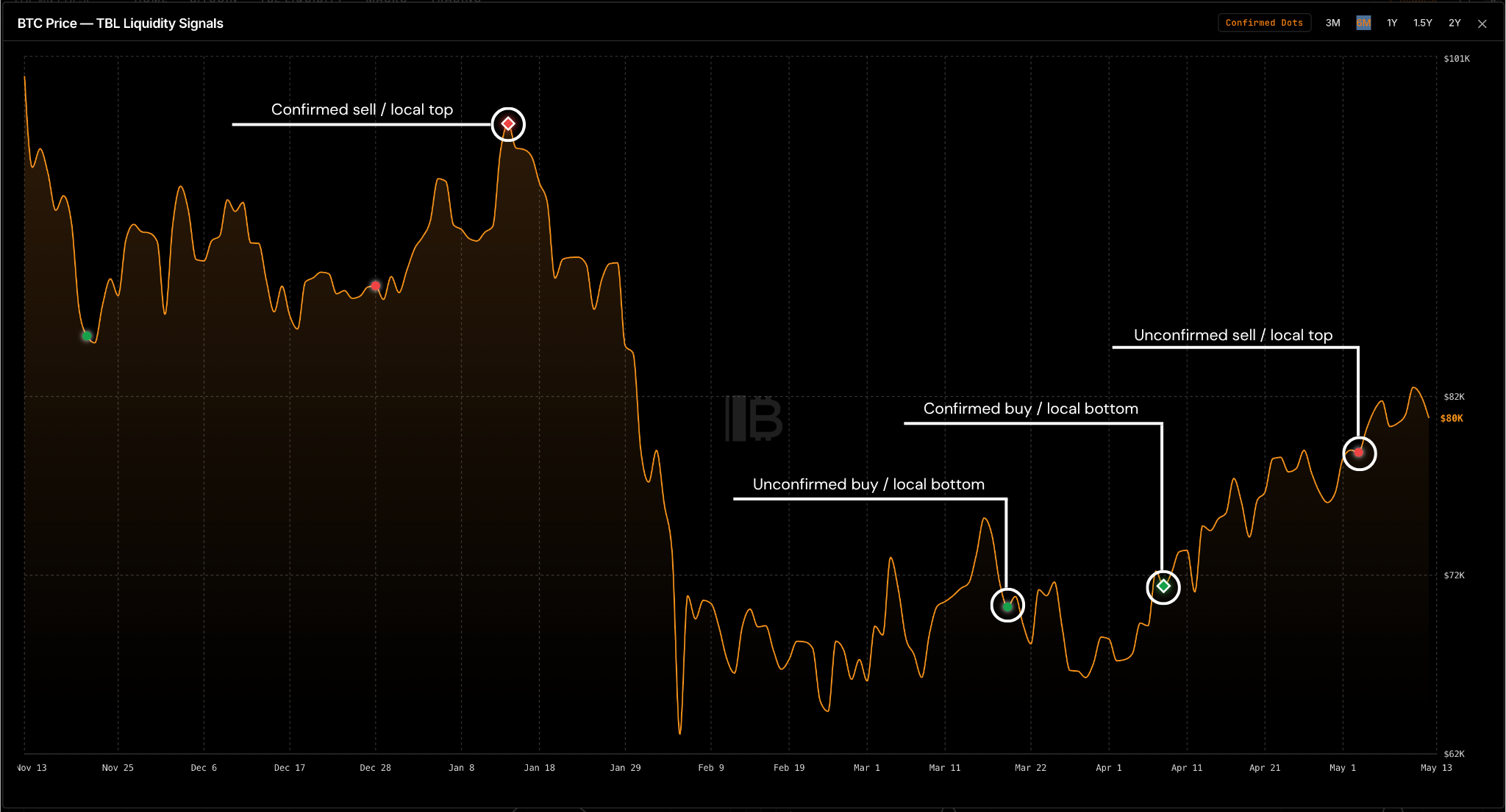
Map 3: The Liquidity Signal
The TBL Liquidity Indicator is built from four components of the U.S. financial system — Treasuries, bond volatility, the dollar, and credit conditions. It’s a different lens than Howell’s global framework: more U.S.-focused, faster-moving, and operating on a shorter timeframe.
The signal system is clean: green dots mark improving conditions, red dots mark deteriorating ones.
An unconfirmed red dot triggered in early May.
“Unconfirmed” matters here. A confirmed signal requires follow-through — the indicator has to see the deterioration persist before locking in the read. An unconfirmed dot is a flag, not a verdict. Think of it like a weather system forming offshore: it’s visible on the radar, it’s worth watching, but it hasn’t made landfall yet. Confirmed signals display as diamonds rather than dots.
Overall, it’s drawing the same conclusion as the global liquidity chart, reached from mostly different data: near-term headwind, but not a structural breakdown.
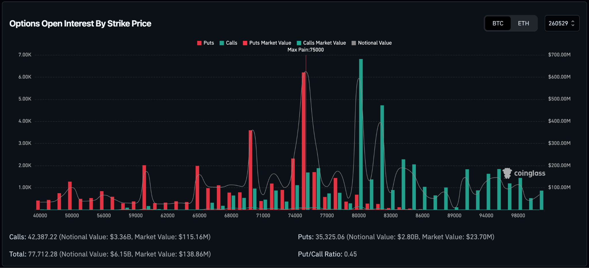
Map 4: What the Options Market Is Pricing In
Deribit is the world’s largest Bitcoin options exchange. When institutional money wants to express a specific view on Bitcoin’s price — not just “up” or “down” but exactly where and by when — Deribit is where most of it lands. The May 29 expiration currently has $6.15 billion in total open interest.
The put/call ratio is 0.45 — roughly twice as many calls as puts. In a vacuum, that reads as bullish.
But the structure is more interesting than the headline ratio. The dominant strikes cluster at two levels: a concentration of puts at $75,000 and calls at $80,000. The single largest options contract across all Bitcoin venues right now is an $80,000 call expiring May 29.
The $75K puts deserve a second look. They’re not primarily bearish positions — they’re hedges. Holders of Bitcoin buying downside insurance against a temporary decline, not bears betting on a crash. The market is saying: we’re still long, we just want a safety net below us.
Then there’s max pain. This is the price at which the maximum number of options contracts expire worthless — the point where the most money evaporates. It’s a gravitational concept: options dealers, who are short a lot of these contracts, have a mechanical incentive to keep price near max pain as expiration approaches. It doesn’t always win. But it’s a pull. For May 29, max pain sits at $75,000.
The picture: a market that holds long exposure, has bought insurance at $75K, and has the most dollars riding on an $80K call. Max pain below, call concentration above, and the price action playing out right around the call concentration.
When the Maps Agree
Four independent sources — a global macro liquidity framework, on-chain price structure, a U.S.-focused liquidity signal, and derivatives positioning — are currently telling the same story:
Near-term caution. Late June through August: a different picture.
This isn’t a crash call. The scale and character of the liquidity injections from late March onward don’t carry the fingerprint of a structural breakdown. The water is still rising — unevenly, in waves, but rising.
The level to watch is $82,000. It’s where the near term rejection is happening, just above where the largest call cluster is positioned, and where max pain gravity is pulling from below. That intersection isn’t a coincidence. It’s where the market’s current tension is centered.
From “Sell the Rip” to “Buy the Dip”
The liquidity regime that shaped the bear period from late 2025 into early 2026 has shifted. What’s changed isn’t just the direction — it’s the character of what’s happening. The injections from late March onward have moved beyond merely stabilizing conditions. At this scale and persistence, the effect appears slightly stimulatory.
That changes the frame for how to read a dip.
If the late May–June headwind the charts are flagging actually materializes, that dip would arrive into a backdrop where liquidity conditions are improving — not deteriorating. The tide would be coming back in. The same framework that once pointed toward sell the bounce is starting to say something different about what comes next.
This is one framework. A confluence of frameworks, but still a framework. Geopolitics can rewrite any script on any given morning — and anyone reading this knows how quickly that can happen.
But when four maps built on different data, by different people, looking at different layers of the market all point toward the same intersection, it’s worth marking on your own map.
The water level is still being determined. But the tide tables suggest it won’t stay low for too long.