

Reading the Tide: A Guide to the Weekly Global Liquidity Chart
What the lines mean, what the projections show, and how to use it.


Every week, I post a chart.
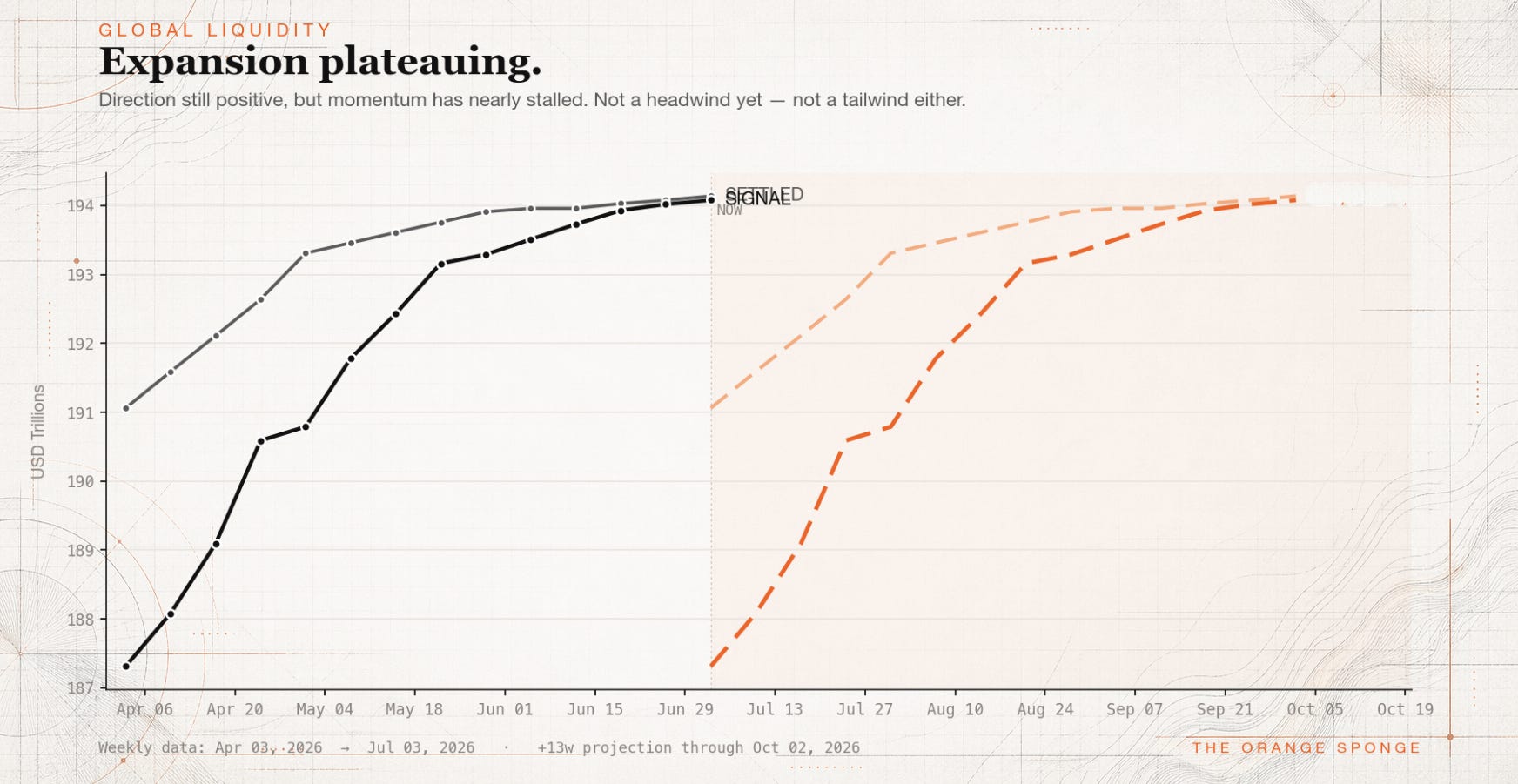
It’s a simple image: two solid lines moving across time, two dashed orange lines projecting forward. A headline like “Broad expansion” or “Crosscurrents” sits above it. A caption sits below it.
That chart contains, in my view, one of the most underappreciated signals in modern markets — a rough map of the tide Bitcoin is swimming in, weeks before that tide shows up in price.
This piece explains what you’re looking at. Bookmark it. Come back to it whenever you see the chart and want a refresher on what any of it means.
Data updated: Tuesday, July 7th, 2026
What the chart is measuring
The chart is a visualization of global liquidity — the total pool of money, credit, and funding capacity sloshing around the world’s financial system at any given moment.
Global liquidity rises when central banks ease, when governments borrow more, when shadow-banking channels expand, when cross-border capital flows accelerate. It falls when central banks tighten, when credit contracts, when funding markets seize up.
Crucially, global liquidity is not the same thing as the money supply in any one country. It is a global composite that pulls together measures of monetary and financial conditions across roughly 90 economies. Nobody living in a single country can see global liquidity by looking at their own central bank. You need a framework that aggregates the whole system.
The framework I use — and the chart is inspired by — comes from Michael Howell and his firm CrossBorder Capital, who have spent decades building what is, in my view, the most rigorous measure of global liquidity publicly available. Howell’s thesis, which I share, is that liquidity is the dominant driver of asset prices over multi-year cycles. Price follows liquidity. Not the other way around.
So every week I take Howell’s weekly liquidity figures, run them through my own chart, and post it under The Orange Sponge brand. The data is his. The visualization and vocabulary are mine.
If you want to go deeper, Howell publishes his thorough analysis on liquidity and the entire macro picture on Substack via Capital Wars. In my view, it’s some of the most rigorous thinking on global liquidity available anywhere. Serious investors should have it on their radar.
The two lines: Signal and Settled
The chart shows two solid lines moving through time.
Signal is the live, weekly read on global liquidity. It is built from countries that publish timely weekly data — roughly a third of the global sample. It captures direction. It captures inflection points. It tells you what is changing now.
Signal is fast. Signal is also partial. Because it only covers a subset of the world, it can be distorted by temporary blips in one region or another. Think of Signal as the early weather report — useful, actionable, but provisional.
Settled is the broader, slower, more complete read. It incorporates data from the full global sample once that data arrives, and it includes revisions as countries update their own figures. Settled is what Signal eventually becomes once the dust settles.
Settled is slow. Settled is also more accurate. Historical revisions smooth out the noise and reveal what actually happened. Think of Settled as the final ledger — the record you trust when you want to know what regime you were truly in.
The distinction matters because the two lines often disagree for a few weeks at a time. When they disagree, something is happening. Signal might be picking up an inflection that Settled hasn’t confirmed yet. Or Signal might be a false alarm that Settled never validates. Both cases are interesting. Both cases are information.
A simple way to hold it in your head:
Signal tells you what is changing.
Settled tells you what changed.
Signal is speed. Settled is certainty.
Signal is timing. Settled is conviction.
Neither line is “better.” They are different tools. The chart shows both because reading them together is more useful than reading either alone.
The dashed orange lines: the forward zone
Here is where the chart earns its keep.
To the right of the “NOW” marker, you will see two dashed orange lines continuing into the future. These are labeled Signal +13w and Settled +13w.
What they represent: the exact same Signal and Settled values you see on the left side of the chart, but shifted forward 13 weeks in time.
Why 13 weeks? Because Howell’s long-running research suggests that changes in global liquidity tend to show up in risk-asset prices — most notably Bitcoin — roughly a quarter later. Liquidity moves first. Price follows. And the approximate lag, averaged over many cycles, clusters around three months.
So the orange lines are not a forecast of liquidity itself. They are a simple visual device: if the historical lag holds, here is roughly where this week’s liquidity reading is pointing risk assets three months out.
When Signal+13w is sloping up, it means the liquidity reading taken three months ago was rising — which historically has been a tailwind for Bitcoin around now. When Signal+13w is sloping down, it means the liquidity three months ago was falling — historically a headwind.
The forward zone is tinted warm orange in the chart because it’s a fundamentally different kind of information from the solid-line data on the left. The solid lines are measurements. The dashed lines are projections of a historical relationship. Your eye should treat them differently. The chart is designed to help you do that.
Important: what 13 weeks actually means
The lag is not exactly 13 weeks. It never is.
In some cycles it has been closer to 10 weeks. In others, closer to 16. In a few, the relationship has broken down entirely for months at a time before reasserting itself. Thirteen weeks is a reasonable central estimate of a historical tendency — nothing more, nothing less.
If you read the chart as “Bitcoin will do exactly what the dashed orange line does, on exactly the date shown,” you will be disappointed. If you read it as “the broader liquidity tide appears to be pointing this direction over the next few months,” you will find it useful.
The chart is best understood as a framework, not a prediction. It is better suited to strategic thinking — am I positioned for the tide that’s coming, or against it? — than to short-term trading. Short-term moves are dominated by positioning, policy surprises, geopolitics, earnings, and a dozen other variables liquidity does not capture.
This chart is one input into a much larger picture. It is the tide. Not the waves.
The regime headlines
Above each chart sits a short headline — something like “Broad expansion” or “Tightening regime” or “Crosscurrents.”
The headline is generated automatically from the last four weeks of Signal and Settled. It is a quick read of the current regime:
Broad expansion — Signal and Settled both rising. The strongest tailwind setup.
Early thaw — Signal rising, Settled not yet confirming. An early constructive sign.
Crosscurrents — Signal and Settled disagreeing in ways that don’t resolve cleanly. Mixed picture.
Losing momentum — Signal weakening, Settled flat. Watch for confirmation.
Peak fragility — Signal rolling over while Settled is still high. Conditions may be topping.
Tightening regime — Signal and Settled both falling. A confirmed headwind for risk assets.
The headline is not a recommendation. It is a label for what the chart is showing, written in plain English so you can file the week in your mind without squinting at the lines.
What this is not
Before I close, a few things this chart is explicitly not:
It is not financial advice. I am not your financial advisor. I do not know your situation, your time horizon, your risk tolerance, or your goals. Nothing about this chart — or anything I write — should be used as a basis for buying, selling, or holding any asset. If you need financial advice, talk to a qualified professional.
It is not a trading signal. The 13-week lag is a multi-month framework, not a short-term trigger. If you try to trade this on a weekly timeframe, you will get whipsawed.
It is not a complete picture. Liquidity is one of many forces that shape asset prices. Positioning, policy, geopolitics, valuation, earnings, narrative, sentiment — all of these matter too. Any serious decision-maker weighs multiple factors. This chart gives you one of them, rendered as clearly as I know how.
It is not an invitation to outsource your thinking. Read the chart. Form your own view. Disagree with mine when it makes sense to.
Why this fits The Orange Sponge
The thesis of this publication is that Bitcoin is a sponge — and that, over time, it absorbs the world’s liquidity the way a sponge absorbs water. When liquidity expands, the water rises, and the sponge soaks it up. When liquidity contracts, the water recedes, and every asset fights harder for what’s left.
The weekly chart is, in a sense, a map of the water level.
It does not tell you what the sponge will do in any single week. It tells you whether the water is rising or falling, whether the tide is coming in or going out, whether the forward zone looks wet or dry. Over long enough timeframes, the sponge and the water converge.
That convergence is the thesis. The chart is one of the ways I track whether the thesis is playing out.
A new version of the chart goes up every week as a Note. This piece is the reference — bookmark it, share it, come back to it when you forget what something means. The chart will keep moving. The framework stays here.
Doesn't this chart get updated anymore