

The $25 Trillion Machine: An Introduction to US Dollar Global Liquidity
Introducing a new quarterly series tracking the BIS Global Liquidity Indicators — the long-arc data that complements the weekly H.4.1 pulse.


Every week I track what the Federal Reserve is doing with its balance sheet. But there’s a bigger picture — and most people have never seen it.
Every Thursday, a new H.4.1 statistical release drops from the Federal Reserve. I read it, extract three numbers, and build the week’s liquidity update around what they’re telling me. It’s a useful signal: how much money is sitting in reserve accounts, whether the Treasury is drawing down its cash balance, whether short-term lending is contracting or expanding.
But the H.4.1 only shows you what’s happening inside the United States. The dollar isn’t just an American currency. It’s the world’s reserve currency — and the world has built a $25 trillion credit structure on top of it.
Once a quarter, a Swiss institution called the Bank for International Settlements publishes a dataset that tracks that structure, and a quarterly revision two months later. Most people have never heard of it. Even among market watchers and financial commentators, it rarely gets the attention it deserves. But in four charts, it contains more information about where the world’s financial system actually stands than almost any other publicly available source.
This is my introduction to that data, charts I’ve built with it, and to the quarterly series I’m building around them. This first issue is based on the
A note on scope: $25 trillion refers specifically to USD-denominated foreign currency credit as tracked by the BIS GLI. Broader measures of global liquidity — such as the framework developed by Michael Howell, which encompasses central bank balance sheets, domestic credit, and cross-border flows across all major currencies — put total global liquidity closer to $190 trillion. This series tracks the BIS component: offshore dollar credit, which is both the most systematically dangerous and the best-documented piece of that larger picture.
What Is the BIS — and Why Should You Trust This Data?
The Bank for International Settlements is sometimes described as “the central bank for central banks.” That phrase is accurate but undersells what makes the BIS useful.
The BIS was founded in 1930 as a forum for the world’s major central banks to coordinate — to settle cross-border transactions, share research, and manage the plumbing of the international financial system. Over time, it became something else: the only institution with both the authority and the access to collect comprehensive data on global banking activity.
When the BIS publishes figures on global foreign currency credit, it isn’t producing estimates or running surveys. It’s aggregating actual reported data from the world’s central banks. This is as close to a real-time global ledger as anything in the public domain.
The Global Liquidity Indicators — the GLI — are one of the BIS’s flagship quarterly datasets. They track how much credit is being extended globally in foreign currencies: primarily US dollars, but also euros and yen. The key phrase is foreign currency — credit extended in a currency that isn’t the borrower’s own. A Brazilian company borrowing in dollars. A South Korean bank issuing dollar-denominated bonds. A Turkish government raising money in euros.
This is the dataset I’ll be parsing every quarter, and when the revision is released. Here’s why it matters.
The Dollar Dependency Problem
Start with a thought experiment.
Suppose you take out a mortgage in US dollars and you earn your income in US dollars. The math is relatively stable. Your debt and your income are denominated in the same unit. If the dollar weakens, both sides of your personal ledger shift together.
Now imagine you borrow in a foreign currency. Your debt is in dollars, but your income is in Brazilian reais. If the dollar strengthens against the real, your debt becomes more expensive — in real terms — without you taking on any new obligations. The value of what you owe has increased simply because exchange rates moved.
This vulnerability is structural, not theoretical. And it sits beneath the surface of the global economy right now, at a scale most people never think about.
Roughly $25 trillion in US dollar-denominated credit currently exists outside the United States. That isn’t $25 trillion in dollar bills sitting in foreign bank vaults. It’s $25 trillion in loans and bonds that foreign governments, banks, and businesses owe — and that must eventually be repaid in US dollars.
This creates a dynamic economists call the dollar doom loop. When dollar credit tightens, borrowers need more dollars to service existing debt, which drives up demand for dollars, which makes the dollar stronger, which makes the debt more expensive to service. Every one of those $25 trillion in credit claims is a thread in the global financial fabric. When enough of them pull at once, you get a crisis.
The BIS GLI is the dataset that lets you see where those threads are concentrated — and whether they’re getting tighter or looser.
The Four Charts
Four times a year, I’ll update these charts with the latest BIS data. Here’s what each one shows and why I care about it.
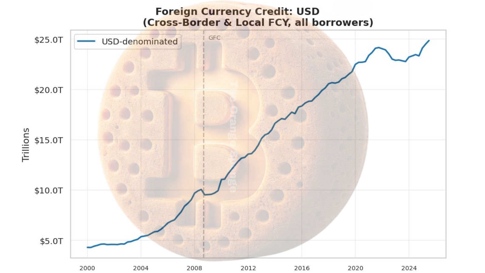
This is the foundational chart. The blue line is total US dollar-denominated credit extended globally — to every country except the US itself.
As of Q3 2025, USD credit stands at roughly $25 trillion. EUR credit sits around $6–7 trillion. The dollar isn’t just larger — it’s approximately three and a half times larger, and the gap has been widening.
The growth story is the part worth sitting with. In 2000, USD foreign currency credit was approximately $5 trillion. In 25 years, it has grown fivefold. The world’s dollar debt has quintupled in a single generation.
Look at what happened after 2008. The line bends upward sharply. Post-crisis quantitative easing didn’t just stabilize the US financial system — it sent a flood of dollar liquidity into the world, funding development in emerging markets, inflating asset prices globally, and building a much larger structure that now requires dollar liquidity to service.
Notice also the brief flattening around 2022–2023. That’s the Fed rate hike cycle at work. When the Fed raised rates aggressively to fight inflation, it made dollar credit more expensive globally, and the 25-year expansion paused. It’s back to growing now.
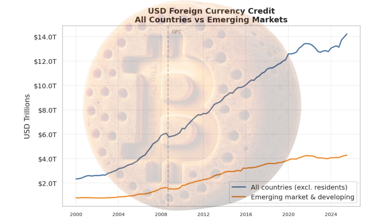
This chart splits the same USD credit data into two groups: all countries (blue), and the subset flowing to emerging market and developing economies (orange).
The gap between the two lines is advanced economy borrowing — the US’s major trading partners and allies, primarily in Europe and developed Asia. The orange line, currently around $4 trillion, is the more structurally vulnerable portion.
These are borrowers whose domestic currencies aren’t dollars. Whose central banks don’t have easy access to the Federal Reserve’s swap lines. Who feel dollar tightening more acutely than anyone else when rates rise and credit contracts.
The orange line is also where Bitcoin adoption trends earliest and most urgently. That’s not a coincidence. El Salvador didn’t move toward Bitcoin because its citizens were crypto enthusiasts. They moved toward it because their economic lives were denominated in a currency they had no power over — and they had no meaningful way to opt out of that arrangement. The orange line is a map of financial vulnerability. Financial vulnerability is where Bitcoin’s value proposition is most immediately legible.
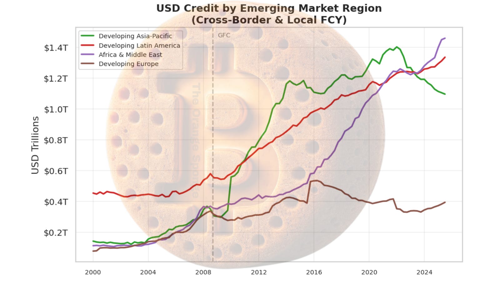
Zoom into that orange line from the prior chart and it breaks apart into four sub-regions: Developing Asia-Pacific, Developing Latin America, Africa and the Middle East, and Developing Europe.
Asia-Pacific is the dominant destination — currently around $1.4 trillion and still accelerating. This reflects China’s position at the center of the Asian development model: infrastructure, trade, manufacturing, much of it financed in dollar-denominated credit. Latin America sits at roughly $1.2 trillion.
The number worth watching is Africa and the Middle East, which has grown sharply since 2015 and now converges with Latin America at approximately $1.2 trillion. This is the next frontier. The region’s rising dollar debt exposure is happening in parallel with some of the most rapid Bitcoin adoption anywhere in the world — which is exactly the sequence you’d expect to see if dollar dependency and Bitcoin appeal are related phenomena.
Developing Europe is the smallest and flattest line, declining after 2008 as European banks pulled back from the region.
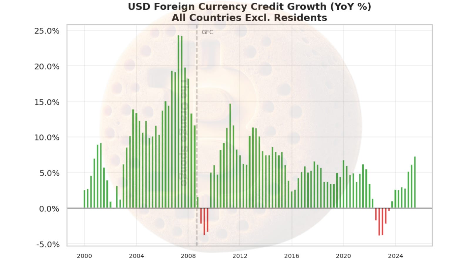
This is the signal chart. Green bars mean global dollar credit is expanding. Red bars mean it’s contracting. The height of each bar tells you how fast.
From 2000 through the Global Financial Crisis, growth ran at 8–25% per year. The GFC produced sharp red bars — a sudden, painful contraction. Then recovery, and steady growth through the 2010s. COVID produced a spike.
Then 2022–2023: the most sustained run of red bars since the GFC. The Fed’s rate hike cycle didn’t just slow down the US economy. It contracted the global dollar credit system for multiple consecutive quarters. That contraction was the mechanism behind the stress you saw in developing markets during that period — currency weakness, inflation, debt servicing difficulties.
The most recent reading: back in positive territory. Approximately 5–7% year-over-year growth. The contraction ended. The expansion resumed.
When this chart flips from red to green after a sustained contraction, it historically marks the beginning of the next leg of the global liquidity cycle. Michael Howell, whose framework I use in the H41 series, has documented the strong correlation between global liquidity inflections and forward moves in risk assets — including Bitcoin, which tends to follow the liquidity cycle with roughly a 13-week lag.
The March 2026 reading is green. The cycle has turned.
What This Has to Do With Bitcoin
Here’s what I want you to hold in mind as I publish these quarterly updates.
The global dollar credit system has grown from $5 trillion to $25 trillion in 25 years. It grows because it has to. The existing debt requires liquidity to service. Servicing requires credit. Credit requires more liquidity. Each expansion cycle builds on the one before it. This is not a criticism of any particular policy decision — it’s a description of how the system is structurally designed to function.
Bitcoin sits outside that system.
Bitcoin’s supply isn’t $5 trillion one decade and $25 trillion the next. It’s 21 million coins, governed by code, on a schedule written in 2009 that cannot be revised by any central bank, government, or committee. While Chart 1 was climbing from $5T to $25T, the Bitcoin issuance schedule was executing exactly as written — indifferent to the 2008 crisis, indifferent to COVID, indifferent to every rate decision the Fed has made.
There’s a thought experiment worth trying. Imagine you could watch both trajectories simultaneously: the dollar credit line climbing fivefold over 25 years, and the Bitcoin supply line growing on its fixed, pre-announced schedule. The dollar line responds to economic conditions, political decisions, and crisis management. The Bitcoin line responds to nothing. It follows mathematics.
That divergence — one expanding in response to human decisions, one expanding according to immutable code — is the long-form case for Bitcoin as a reserve asset. Not because Bitcoin is more convenient for everyday transactions. Because over long timeframes, the dollar credit system has consistently expanded, and expansion means each existing dollar claim is worth less over time.
This isn’t a new observation. It’s the same argument Gromen makes about sovereign debt. It’s the same argument Howell’s liquidity framework implies. And it’s what the BIS data shows, quarter after quarter, in the slow rightward climb of Chart 1.
What This Series Will Track
This initial release represents the Q3 2025 revision data.
Starting with the next issue, I’ll publish a BIS GLI update each quarter when initial data releases and a separate article when the revision for that quarter is released. The Q4 2025 release is scheduled for April 30th.
Each update will show the four charts with current figures, note what changed quarter-over-quarter, and identify any signal worth attention: a direction change on Chart 4, an acceleration in a particular region, a widening or narrowing of the gap between advanced and emerging economy borrowing.
This series complements the weekly H.4.1 / Fed Liquidity Watch. The H41 is the short-term pulse — what the Fed is doing this week, whether money is flowing toward or away from the economy right now. The BIS GLI is the long-arc structural picture: the 25-year expansion of global dollar credit, the distribution of that debt across regions and borrower types, and the signal that tells us whether we’re in an expansion or contraction phase.
Together, they form a clearer picture of where global liquidity actually is — and where it tends to go.
The Q3 2025 reading: the system was expanding again. The 2022–2023 contraction ended. Year-over-year growth is running around 5–7%. The global dollar credit machine, after its longest pause since the GFC, was back to doing what it has done for 25 years.
The $25 trillion machine has been running, but I expect Q4 2025 and Q1 2026 to tell a different story.