

What $3 Trillion in Reserves Actually Means
Adding a New Metric to the Weekly H.4.1 Report — And Why


Every week I report the reserve balance — the banking system’s collective checking account at the Fed. This week it was $3.14 trillion. Last week it was $3.08 trillion. The week before, $3.08 trillion again.
That number matters. But it doesn’t tell you enough.
Here’s the problem: $3.14 trillion sounds like a lot of money. It is a lot of money. But the question isn’t how much is in the account. The question is how many claims exist against it.
Think of it like a checking account with a very large balance — but also a very large number of outstanding checks you’ve written. The balance alone doesn’t tell you whether you’re solvent. The balance relative to the outstanding checks does.
The banking system works the same way. When the Fed floods banks with reserves during QE, banks don’t just sit on them. They issue more promises to hand out cash on demand — more checking accounts, more credit lines, more overnight commitments. Those promises accumulate. When QT comes and reserves shrink, the promises don’t shrink with them.
A paper presented at Jackson Hole in 2022 — “Liquidity Dependence,” by Acharya, Chauhan, Rajan, and Steffen — documented this mechanism in detail. Their key finding: a shrinkage of reserves without a commensurate decline in claims on liquidity is what left the system vulnerable in September 2019. The repo market didn’t seize because there wasn’t enough money in absolute terms. It seized because the ratio of claims to available reserves had quietly returned to pre-QE levels while nobody was paying close attention to it.
That ratio is what I want to start tracking here.
Starting this week, the H.4.1 Liquidity Watch will include a Claims on Reserves Ratio alongside the standard four figures. The formula is simple: total commercial bank deposits divided by reserve balances. Higher means more claims per dollar of buffer. The September 2019 level — the one that preceded the repo spike — is the reference point to watch.
Here’s where the ratio has been since 2009:
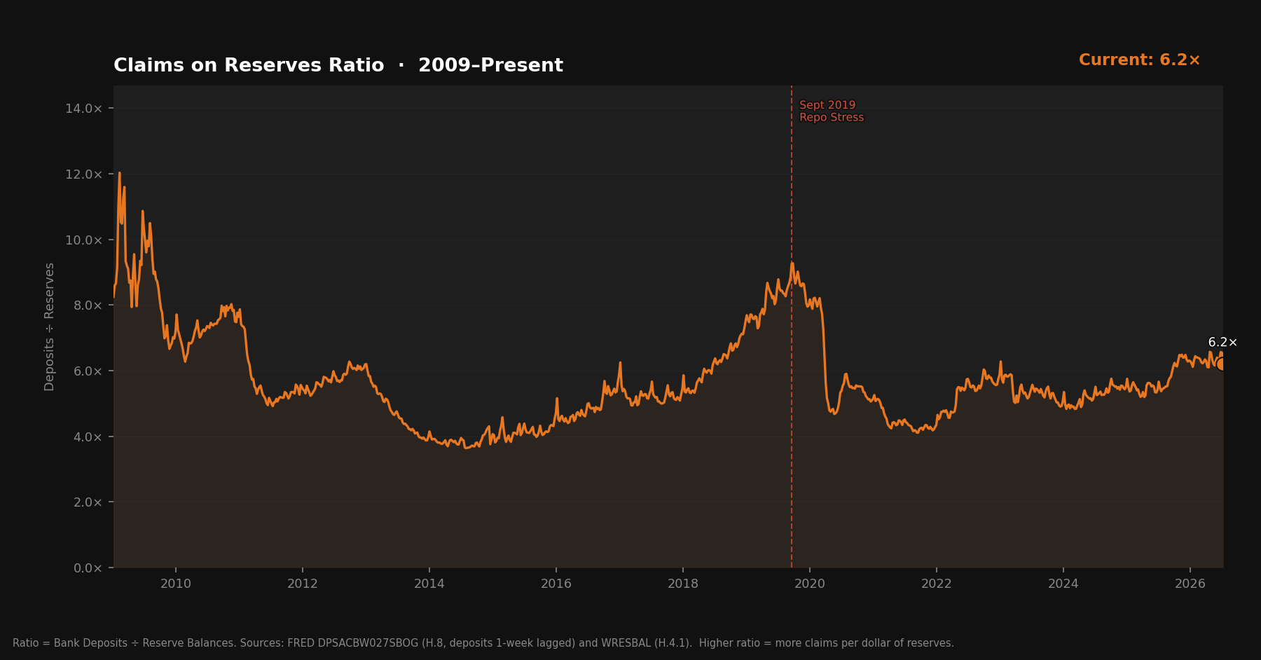
The shape of that chart tells the whole story in one image. QE floods reserves, ratio falls, system is comfortable. QT withdraws reserves, ratio rises, system gets stretched. September 2019 sits near the top of the QT arc — the point where the stretch finally broke something.
After the pandemic QE, the ratio fell sharply again. That second QT cycle just ended — the Fed stopped active runoff in late 2025 and shifted to reserve management purchases. But the ratio climbed throughout that window, and it hasn’t reversed.
Here’s the trailing 52-week view:
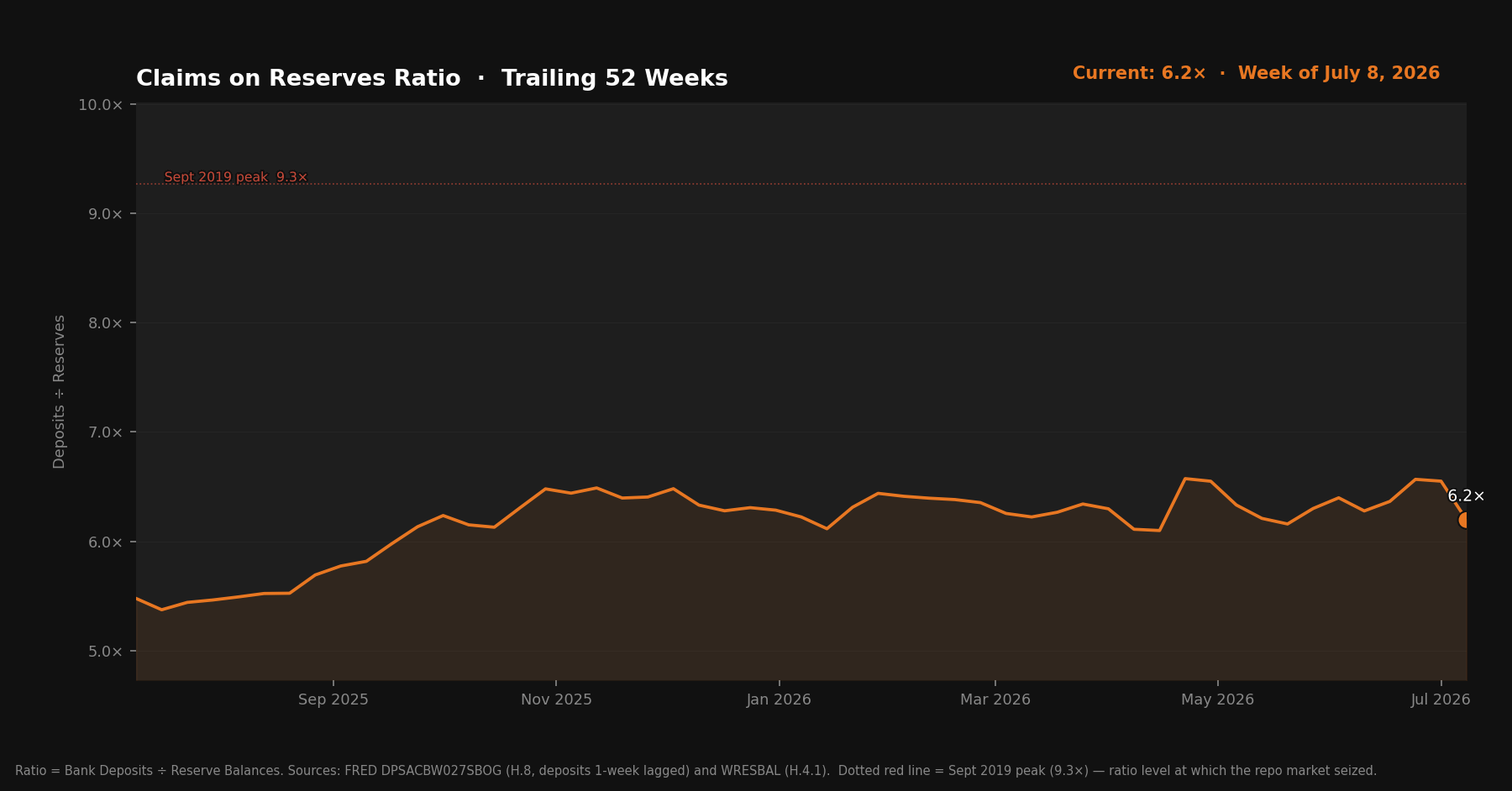
The current reading is 6.19×. The September 2019 peak was around 10×. There’s meaningful distance between here and there. The system isn’t stretched in the way it was before the last repo crisis.
But the direction matters as much as the level. The ratio has been rising. Whether it continues rising, stabilizes, or reverses as the TGA drawdown adds reserves back — that’s what the weekly data will start to tell us.
One caveat worth naming: the Standing Repo Facility exists now and didn’t in 2019. Primary dealers can borrow reserves against Treasuries at a known rate if they need them. The same ratio doesn’t carry the same fragility it once did, at least at the dealer level. The SRF is a real improvement to the plumbing. Whether it’s enough if stress becomes system-wide is a different question.
I’ll update the ratio each week alongside the standard figures, watch for directional trends, and flag it when the level starts to matter. For now, the baseline is set.
The Claims on Reserves Ratio uses deposits from the Federal Reserve’s H.8 release (FRED: DPSACBW027SBOG) and reserve balances from the H.4.1 (FRED: WRESBAL). Deposit data carries a one-week lag — H.8 publishes Fridays, one day after H.4.1.