

Christmas in July???
Global liquidity set this clock in April. Here's what the data says happens next.


Bitcoin dipped below $58k. A few days later, it’s back above $61k. The headlines of course went from doom (dip) to delight (bounce). But not many seem to have a view that both were roughly on schedule.
That’s the thing about the global liquidity framework I look at every week. It doesn’t predict price with precision, but it does map timing windows.
In other words, it forecasts periods when the data suggests the environment is favorable for a move, and periods when it suggests the opposite.
If you’ve new to this chart, check out the article below for the full explainer:

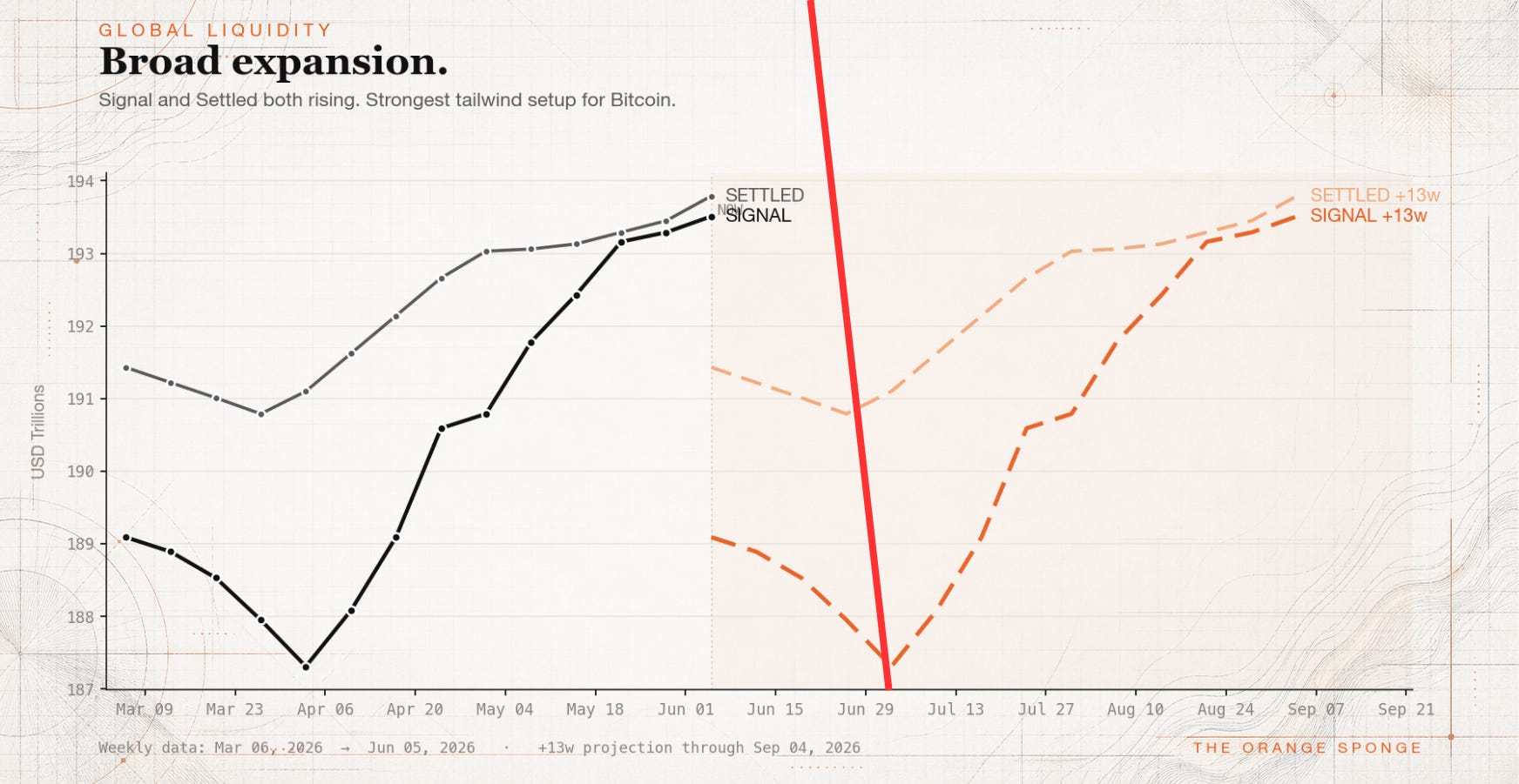
April 2026 was a sharp acceleration window which followed a non-trivial decline. I wrote about it in real time. Add thirteen weeks to the start of that acceleration, and you land in early July.
Right here.
So yes: hitting a floor around now was on my calendar. So is it Christmas morning or just a department store that put the decorations up too soon? Based on liquidity, I’m gettin my boogie on at the holiday shindig, but certainly dancing near the door.
How the Clock Was Set
The liquidity framework I use here is rooted in Michael Howell’s research at CrossBorder Capital. His two series — Signal (the live read - that he calls the ‘flash’ reading) and Settled (the revised figure - what he calls the full reading) — together map the global flow of credit and money. Bitcoin has a historical tendency to trace that flow with roughly a thirteen-week lag. When liquidity accelerates, Bitcoin tends to follow about a quarter later. When it decelerates, the same.
The critical distinction is that the absolute level matters less than the rate at which it’s changing. A liquidity environment that’s technically rising but slowing down is not the same animal as one that’s rising and accelerating. Speed and direction work together. Separately, they can mislead.
In early April, global liquidity wasn’t just rising. It was running hard. Signal jumped roughly $3.5 trillion over four weeks or close to $0.87 trillion per week. That pace was the fuel. Shift it forward thirteen weeks, and the ignition point lands in early July. That’s the basis for the bounce thesis I’ve held since spring.
This week’s chart shows Signal at $194.02 trillion, Settled at $194.08 trillion. Both still rising — but the weekly gains are now $0.09T and $0.05T, respectively. The April pace was nearly ten times faster. The acceleration that set the clock has run its course. What’s left in the tank is some near term momentum from that earlier burst.
Seeing the Lag on One Chart
If you want to see the thirteen-week lag rather than take my word for it, overlay the two series and let them speak.
Here’s Howell’s Global Liquidity Index measuring six week changes, shifted forward thirteen weeks, laid over a basket of large-cap crypto (BTC, ETH, SOL) going back to 2021 (also six week changes).
The black line is six-week % changes in liquidity (LHS) pulled forward +13 weeks. The orange line represents the current six-week % changes of the basket (RHS). What jumps out is how often the direction moves together and lines up — peaks into peaks, troughs into troughs, over and over across five years.
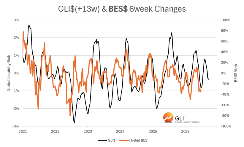
It isn’t a perfect tracing. No two cycles rhyme exactly, and the fit loosens in stretches where other forces take over. But the shape holds often enough that the lag stops looking like a coincidence and starts looking like a mechanism. And where the lines sits today is exactly why early July was circled on my calendar.
What’s Showing on the Ground
The on-chain data independently corroborates what the liquidity framework is pointing to, and I think it’s worth noting when the two converge.
James Check — who writes under the handle Checkmatey at Checkonchain — has been documenting what he calls a “progressive lessening of downside momentum” across multiple Bitcoin indicators. His framing: each leg lower is arriving with less conviction than the one before it. Price made a marginal new lower low last week, briefly touching below $58,000. But the momentum indicators underneath that print are not confirming the breakdown. Weekly RSI is diverging positively. Realized-loss momentum is back to levels last observed in December 2022 and February 2019 — both of which, if you know your cycle history, were close to major lows.
Long-term holders are sitting on 83.4% of supply which is an all-time high. They’re underwater by roughly 15.5% on an adjusted basis, and they are not selling. The buyers who purchased near $80,000 transferred approximately $42 billion in coin to new hands near the 200-week moving average (around $62,000). What’s left is a market that’s become bottom-heavy: coins concentrated in the hands of people who have already decided to hold through noise.
Check’s read on the character of the market right now: this is late-stage bear behavior. The divergences, the holder structure, the fading downside momentum — they look more like something being hammered into a floor than something with a long way left to fall.
A Second Clock, Same Timeframe
There’s one more read worth putting next to the liquidity picture, because it was built independently and it points to the same window.
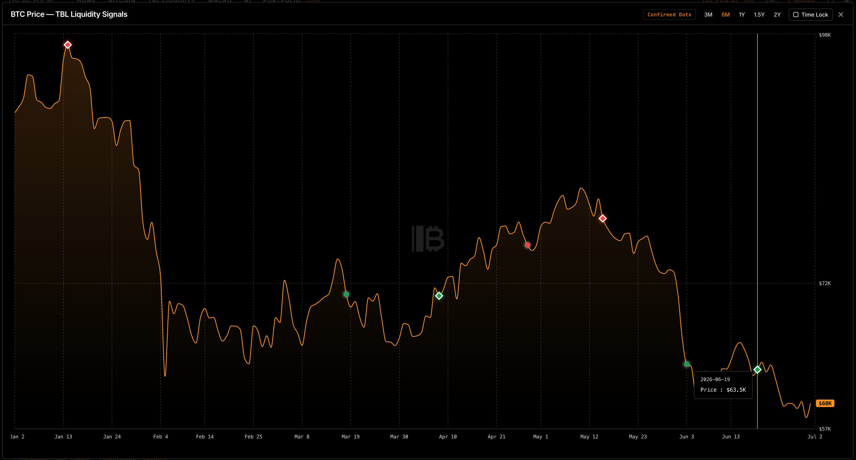
The Bitcoin Layer runs their own liquidity indicator that marks the chart with green and red dots — green for accumulation, red for distribution. Circles are unconfirmed; filled diamonds are confirmed. Over the last six months the reds clustered near the tops and the greens near the bottoms, which is the whole point of a signal like this. The most recent mark, printed near $63,000, is a confirmed green.
Two different tools, built on two different macro foundations landing on the same stretch of calendar. That’s the kind of convergence I pay attention to. No one has a crystal ball, but when two strong independent methods agree, the odds that they’re both wrong get smaller.
Why This Might Not Be Christmas Morning
Here is where I have to be honest about what the same framework is now showing.
The acceleration that started the clock running in April has faded. Under the rate-of-change logic (the exact same principle that called the timing of the bounce) a decelerating liquidity uptrend eventually transmits into a rally that lacks follow-through. A nice July bounce (if there is one) would be fuel from April. That fuel is burning down. Without a new, faster wave of liquidity injections, the next thirteen weeks project a chart that levels off, not one that surges.
Layer that with the dollar. DXY has broken above 100 and cleared its own 200-week moving average. That threshold matters for a specific reason. There is a vast amount of dollar-denominated debt owed outside the United States. When the dollar strengthens, servicing that debt costs more in local currency terms. Countries tighten, sell assets, raise dollars. The global liquidity environment can be nominally rising while the effective transmitted liquidity is being offset by dollar demand pulling in the opposite direction. The sponge fills and drains simultaneously.
And then of course there’s Strategy.
This week, Michael Saylor’s company filed what it’s calling the Digital Credit Capital Framework. The board authorized selling up to $1.25 billion in Bitcoin to support its USD reserve. It also includes language that authorizes sales outside of that $1.25B to fund preferred dividends and authorized buyback programs. The “never sell” era now has a formal end date. Strategy holds 847,363 BTC at an average cost of roughly $75,651, which is deeply underwater at today’s price. Their preferred securities trade at effective yields between 15% and 20%. The printing press that funded the accumulation is effectively offline.
Checkmate’s framing of this overhang packs a powerful punch: *”Mr. Market wants Mr. Saylor’s Bitcoin”
The Wildcard Worth Watching
Every bear market has a final sacrifice — a discrete event that clears the overhang, removes the perceived risk, and shifts the character of the market. In 2022 it was FTX. Before that, various forced liquidations. The pattern shows up consistently.
If Strategy’s $1.25 billion authorization turns into actual selling and that selling gets absorbed, it could be less of a doom event and more of a clearing event. A large, visible supply source removed from the market. The loudest bear argument retired. A structural improvement in the outlook arriving on the back of the worst news cycle.
That’s not a prediction because the timing and size of any sales are genuinely unknowable. But I think it’s a scenario worth holding in the background, especially if a meaningful bounce develops. The same event that looks like maximum pain on the way down can function as the mechanism that ends the bear on the way through.
Where That Leaves Things
The clock set in April is ringing. The on-chain structure looks like something forming a floor. I’m expecting a real bounce by mid July, and for anyone watching the liquidity cycle, the timing is not a surprise.
“Real bounce” and “bull market return” are different things, though. The deceleration in the liquidity data, combined with a dollar that just cleared a historically significant threshold and a Strategy overhang that just formalized itself, suggests the move has a ceiling that the data itself already described. Liquidity that’s rising but no longer accelerating is still water supporting a floor — not an incoming tide.
What changes that picture? A new round of global liquidity acceleration. A lower dollar. A clearing event that resets the risk picture. One or more of those, and the thesis upgrades from bounce to something with more durability.
Until then, I’ll keep watching the data that comes in and I’ll tell you what I see.