

Reading the Tide 2.0: The Forward Only Edition
Why the current-week lines are gone, what the +13-week view is really for, and how to read it without over-trusting it.


Back in April, I wrote a guide explaining the chart I try to post weekly when Michael Howell releases his updated global liquidity report:

The quick run down:
Two solid lines for where global liquidity stood that week
Two dashed orange lines projecting that same data 13 weeks forward.
Four lines, one chart, a lot to take in for something meant to be a quick weekly read.
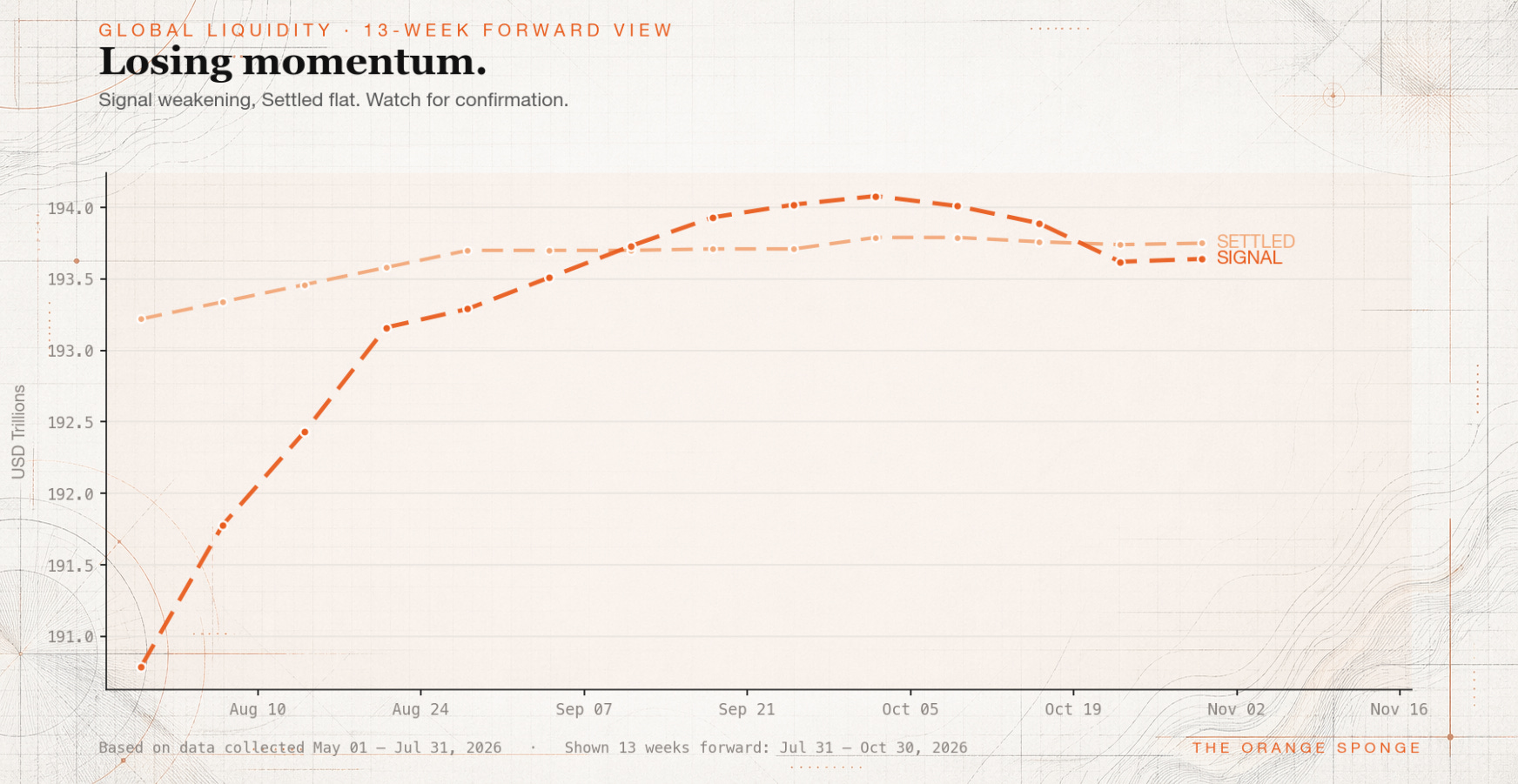
I’ve changed the chart. Starting now, you’ll only see two lines: Signal and Settled, both shifted 13 weeks forward. The current-week numbers are gone from the picture entirely.
This piece explains why, and what to do with the chart now that it looks different.
Why cut two lines
The old chart tried to do two jobs at once. The solid lines showed a measurement — this is what global liquidity did this week. The dashed lines showed a projection — if the historical lag holds, here’s roughly where that measurement points Bitcoin three months out.
A measurement and a projection are two different kinds of information, and I was stacking both on one chart every week.
Here’s the thing I kept running into: the current-week lines were never really the point. Nobody needs a chart from me to know what global liquidity did last week — that number is one search away, straight from Howell’s own site. What the chart is actually for is answering a different question entirely: given what liquidity was doing roughly a quarter ago, what should Bitcoin be doing right now?
That’s a forward-looking question, so now it gets a forward-looking chart. Signal +13w and Settled +13w. Nothing else.
What you’re looking at now
Two lines, same two series as before, just without the pair that used to sit next to them.
Signal is the fast read on global liquidity — built from the roughly one-third of the global sample that reports data weekly. It moves first and catches inflections early, at the cost of being partial.
Settled is the slow read — the full global sample, revised as more data lands. It moves later and is less likely to be a false alarm.
Both lines on the chart are those same two series, shifted 13 weeks forward in time. Howell’s research on the relationship between global liquidity and risk-asset prices puts the lag at roughly a quarter — liquidity moves, and Bitcoin tends to follow a few months later. The chart takes that relationship and does the shifting for you, so what you’re looking at is always this: roughly where liquidity from 13 weeks ago is pointing Bitcoin, right now and over the next few months.
The part that’s actually new: you can check the chart’s work
This is the real reason for the redesign, not just decluttering.
Every point on the +13w line corresponds to a real liquidity reading from 13 weeks earlier. Which means every point is also a claim: liquidity conditions back then implied Bitcoin should be doing this, roughly, right about now.
That claim is checkable. Each week, I can hold the +13w line up against what Bitcoin actually did and ask the honest question — is the tide doing what the chart said it would? I plan to do exactly that going forward, out loud, in these posts. Not to prove the framework is always right. It won’t be. But a framework I’m willing to check openly against reality is worth more than one I just assert and move on from.
The old four-line chart buried that comparison under two extra lines that had nothing to do with it. The new chart makes the comparison the whole point.
Where the current numbers went
I still care about this week’s raw Signal and Settled figures. I just don’t think they belong on this particular chart anymore.
You’ll still see them in the weekly Note, as text, alongside the chart. If Signal jumps or Settled rolls over, I’ll say so directly in the caption. What’s changed is that the chart now shows exclusively where the data is headed, not where it currently sits. Read the caption for today. Read the chart for the next three months.
What 13 weeks actually means
The lag isn’t a fixed constant. It’s a historical tendency, and it wanders — closer to 10 weeks in some cycles, closer to 16 in others, and occasionally it breaks down for a stretch before reasserting itself. Thirteen weeks is a reasonable center point, not a schedule.
Read the chart as “the broader tide appears to be pointing this direction over the next few months” and you’ll get real use out of it. Read it as “Bitcoin will do exactly this, on exactly this date” and you’ll be disappointed on a fairly regular basis.
This is a framework for strategic positioning, not a signal for a Tuesday trade. Short-term price is dominated by a dozen things liquidity doesn’t capture — positioning, policy surprises, geopolitics, whatever narrative is loudest that week. The chart is the tide. It was never the waves, and it still isn’t.
The regime headline still comes from today’s data
One thing hasn’t changed: the headline above the chart — “Broad expansion,” “Tightening regime,” whatever it reads this week — is still generated from the current week’s Signal and Settled, the same raw figures that used to appear as solid lines.
That’s intentional. The headline tells you the mood right now. The chart tells you where that mood is headed. They’re pulling from different points in time on purpose — the headline from this week, the two lines from 13 weeks ago — and that’s a feature, not something to reconcile away.
What this still isn’t
Everything from the original piece holds:
Not financial advice. I don’t know your situation, your time horizon, or your risk tolerance. Nothing here should be the basis for a decision about your money.
Not a trading signal. This is a multi-month framework. Trade it on a weekly timeframe and you’ll get whipsawed.
Not the whole picture. Valuation, positioning, narrative, and a handful of other forces shape price alongside liquidity. None of them show up on this chart.
Not something to outsource your thinking to. Form your own view, and disagree with mine when the data says you should.
Why this still fits the sponge
The thesis under all of this hasn’t moved. Bitcoin absorbs liquidity the way a sponge absorbs water. When the water rises, the sponge soaks it up. When it recedes, every asset fights harder for what’s left.
The old chart tried to show you the water level today and the water level three months out, side by side. The new one just shows you where the water is headed, because that’s the number that actually tells you something about the sponge.
This piece replaces “Reading the Tide,” published back in April. Same framework, cleaner chart, and now a running record of whether the tide showed up when it said it would. If you’re new here, this is the only reference you need going forward.